
We all love Bootstrap framework for so many reasons but, there are quite a few of us who hate its default menu behaviour mainly because it's optimised for touch, with little consideration for desktop devices. My view is that both should be given equal consideration because we're simply not that far along in the future to ignore desktop devices. Judging by developer responses in Bootstrap issue queue this is not about to change and we will most likely never see its menus behaving like they do in Zurb Foundation framework for example.
There has been a lot of discussion in Drupal 7 Bootstrap theme project issue queue relating to revealing submenu's on hover instead of click event which is the default Bootstrap behaviour. The other thing that bothered a lot of people including myself was «dead» parent menu items that wouldn't navigate to a page or node as is the default Drupal menu behaviour as well as, behaviour most people are used to and still expect it at least on desktop devices. Indeed I was the one to originally start the discussion and help find a workable solution in Bootstrap 7.x-2.x issue queue.
Then Bootstrap 3 was released with even more reasons to love it and an extra reason to hate its default menu behaviour — .dropdown-submenu support was removed. Predictably Drupal's Bootstrap theme project issue queue reactivated on the matter just as it did all over the web for non Drupal themes. We cannot nor should we expect Drupal Bootstrap theme project managers to tackle the issue as they are understandably so trying to stick with default Bootstrap behaviours, and they are volunteers after all. But there is a solution I found that I am happy to share, and it is surprisingly simple to implement.
THE SOLUTION
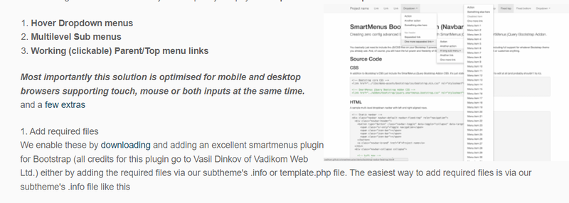
the following tutorial will show how you can quickly adapt your Drupal 7.x-3.0 Bootstrap sub theme to have:
2. Override default Bootstrap 7.x-3.0 base theme behaviours
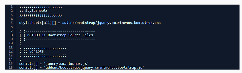
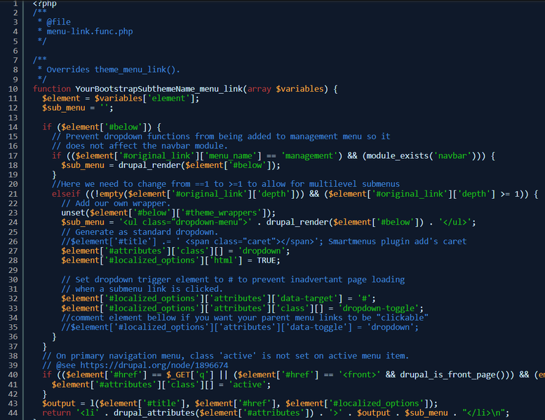
Next we'll need to edit our menu-link.func.php file so that we can override default Bootstrap behaviour like in example shown bellow. We are only commenting out 3 lines here, and example contains comments next to or above each line we are editing so it's all self explanatory. Remember to follow same folder structure in your subtheme when adding overrides /YourBootstrapSubthemeName/theme/menu/menu-link.func.php
! Important: My understanding is that base theme is undergoing some major refactoring and this post will probably need to be updated once version 3.1 is released.
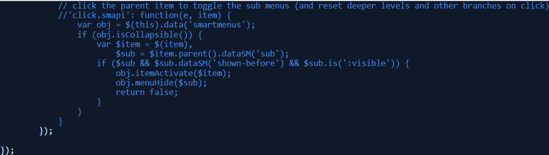
3. Optional: Enable default smartmenus plugin behaviour for mobile devices.
With changes we made so far we have all 3 behaviours working on desktop devices. However, on mobile devices clicking on parent menu still opens the submenu dropdown and closes it on second click which is default Bootstrap behaviour and makes it impossible to navigate to parent menu page. Menu's behaving differently on different device types is a really bad UX so I opted to use the default smartmenus behaviour for mobile devices: one click on parent menu item opens dropdown submenu, on second click it will navigate to parent menu page, and in my view this provides a more natural user experience.
Once again, to enable this behaviour we need to make minimal changes to /addons/bootstrap/jquery.smartmenus.bootstrap.js by commenting out a few lines of code around line 50 as follows
And that's all it takes. End result however, is amazing. Not only do you get your menus to behave the way most people still expect them to on desktops but, you also have them behaving great on mobile, touch devices as well.
Some of the key features quoted from author's website
- Optimised for mobile and desktop browsers supporting touch, mouse or both inputs at the same time
- Section 508 compliant and fully accessible to assistive technology like screen readers
- Unlimited menu trees on the same page and unlimited sub menu levels supported
- Horizontal or vertical main menu items arrangement
- Absolute/relative/fixed positioning for the main menus supported
- Right-to-left and bottom-to-top display of the sub menus is possible
- Full support for RTL text/pages (e.g. Hebrew, Arabic)
- Full window size detection — the menus will always be kept inside the window's boundaries
- Automatically adjustable width for the sub menus is possible (including min/max settings)
- Keyboard navigation friendly (Tab key)
Image Upload
Add image